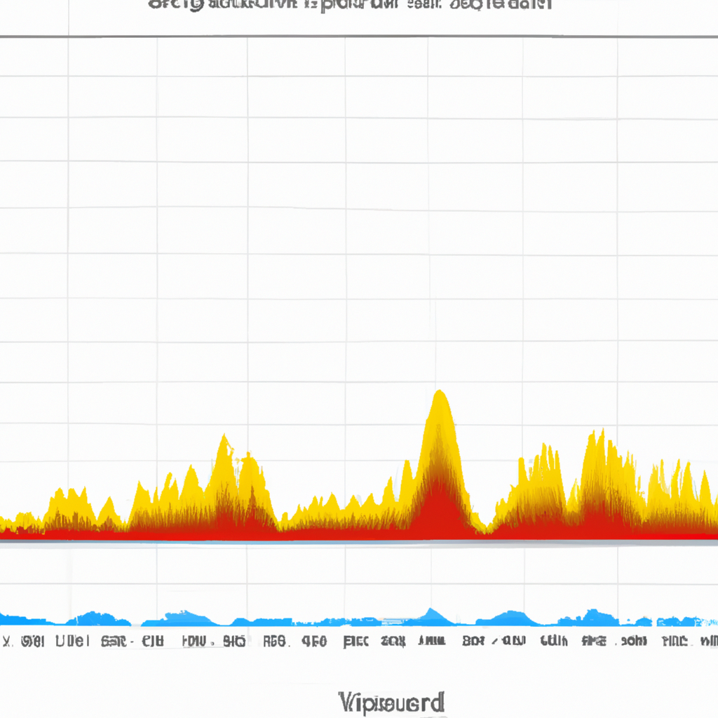
MACD Histogram Interpretations
The Moving Average Convergence Divergence (MACD) histogram is a popular technical indicator used by traders to identify potential trend reversals, momentum shifts, and entry or exit points in the financial markets. It is derived from the MACD line and the signal line, which are both based on moving averages. The MACD histogram provides additional insights into the strength and direction of a market trend. In this article, we will explore the various interpretations of the MACD histogram.
1. Positive Histogram
A positive MACD histogram occurs when the MACD line crosses above the signal line and the histogram bars turn green or rise above the zero line. This indicates that the bullish momentum is increasing, and the buyers are gaining control over the market. Traders often interpret this as a signal to enter long positions or hold existing long positions.
2. Negative Histogram
A negative MACD histogram occurs when the MACD line crosses below the signal line and the histogram bars turn red or fall below the zero line. This indicates that the bearish momentum is increasing, and the sellers are gaining control over the market. Traders often interpret this as a signal to enter short positions or hold existing short positions.
3. Divergence
Divergence occurs when the MACD histogram moves in the opposite direction of the price action. There are two types of divergences:
- Bullish Divergence: Bullish divergence occurs when the price makes lower lows, but the MACD histogram makes higher lows. This suggests that the selling pressure is weakening, and a potential trend reversal to the upside may occur. Traders often interpret this as a signal to look for buying opportunities.
- Bearish Divergence: Bearish divergence occurs when the price makes higher highs, but the MACD histogram makes lower highs. This suggests that the buying pressure is weakening, and a potential trend reversal to the downside may occur. Traders often interpret this as a signal to look for selling opportunities.
4. Convergence
Convergence occurs when the MACD histogram moves in the same direction as the price action. This indicates that the trend is strong and likely to continue. Traders often interpret this as a signal to stay in their current positions or look for additional opportunities in the same direction as the trend.
5. Zero Line Crossover
A zero line crossover occurs when the MACD histogram crosses above or below the zero line. When the histogram crosses above the zero line, it indicates a shift from a bearish to a bullish trend. Conversely, when the histogram crosses below the zero line, it indicates a shift from a bullish to a bearish trend. Traders often interpret these crossovers as potential entry or exit signals.
6. Histogram Width
The width of the MACD histogram bars can provide insights into the strength of the trend. Wider bars indicate a stronger trend, while narrower bars suggest a weaker trend. Traders often interpret wider bars as a signal to hold their positions, while narrower bars may indicate caution or a potential trend reversal.
Conclusion
The MACD histogram is a versatile technical indicator that provides valuable insights into market trends, momentum shifts, and potential entry or exit points. By understanding the various interpretations of the MACD histogram, traders can make more informed trading decisions and improve their overall trading performance.
